The Drum, in association with Synergist, brings you a round-up of some of the latest interesting creative work.
Every fortnight The Drum, in association with Synergist, publishes a selection of new creative work. The next issue of The Drum (19 July) is being made in front of a live audience today. Audience members at today's event will be voting on The Works and online readers can still vote now with voting open until 2pm this afternoon. Act quick and make sure you cast your vote.To submit work for future publication contact gillian.west@thedrum.com.
Grey London: Puma Dance Dictionary
Brand: PumaTitle(s): Puma Fragrances presents the Puma Dance Dictionary Agency: Grey, London, UKAgency website: http://www.grey.co.uk Chief Creative Officer: Nils LeonardCreative Director: Andy LockleyAdditional credits: Creative team: Ryan Connolly, Henrik RidderheimDesigners: Ryan Connolly, Chris ChapmanAgency Producer: Rebecca PopleAssistant Agency Producer: Alex ManziCreative Producer: Maxine HoseDigital Producer: Andreas Zaremba, Sarah Brennan, Peter JacobsDigital Strategist: Jez DuttonInformation Architect: Colin FranksManaging Partner: Sam SoutheyBusiness Director: Susan Pratchett, Blair MeylerAccount Director: Youssri RahmanPlanning Director: Christianne HamiltonProduction Company: SomeSuch&CoDirector: Daniel WolfeDirector of Photography: Andre ChematovProduction Company Producer: Lee Groombridge.Editors: Matt Newman, Chris Brown, Tom Lindsay, Vee Pinot, Michelle Difrancesco, Marvin Alvarez @ Hogarth / TrimAfter Effects: Russ Tams @ HogarthPost Production: Hogarth / FramestoreSound Design: Liam Conwell at HogarthMusic: Dre Skull featuring Megan James & PopcaanMusic Supervisors : Dom Bastyra @ Platinum Rye / David Laub @ First and LastChoreographer : Super DavePublished: May 2013Short rationale (optional): Before there were words, texts, tweets, we had body language.The Puma ‘Dance Dictionary’ is a new language of dance created to launch the new Puma Sync Fragrances.A form of non-verbal communication that enables people to speak with their bodies, encrypting words into dance moves.At the heart of the Dance Dictionary is a unique messaging platform that translates words into dance. A social tool that lets people dance the things they would dare not say. Each word of the message is converted into a unique dance move and edited together to form a whole sentence. This video can then be shared on social networks or e-mailed to someone directly.More expressive than a status update. Cooler than a tweet. More flirtatious than text.Puma Fragrances collaborated with a host of the world’s best freestyle dancers including Storyboard P, King Charles, PacMan, Ron Myles AKA Prime Tyme and Krumpers Big Mijo, Outrage and Worm and A-List Choreographer, Super Dave.Beyond the message translator, the Dance Dictionary will serve as a comprehensive inventory of Dance moves and their definitions for Freestylers.Brooklyn based Dancehall producer Dre Skull has collaborated with vocalists Megan James and Popcaan to create a track for the Dance Dictionary which launched last week. A music video to accompany the track has been shot by multi award winning Director, Daniel Wolfe.The Dance Dictionary will also feature in a TV commercial across Europe.
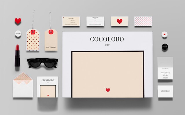
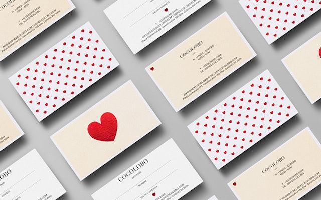
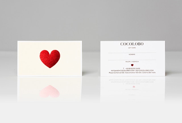
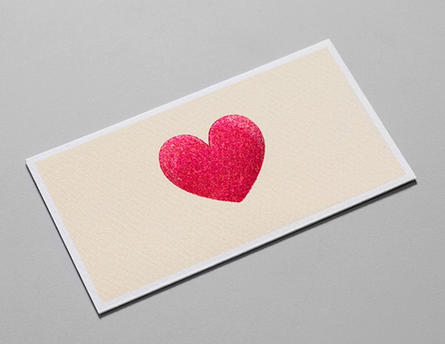
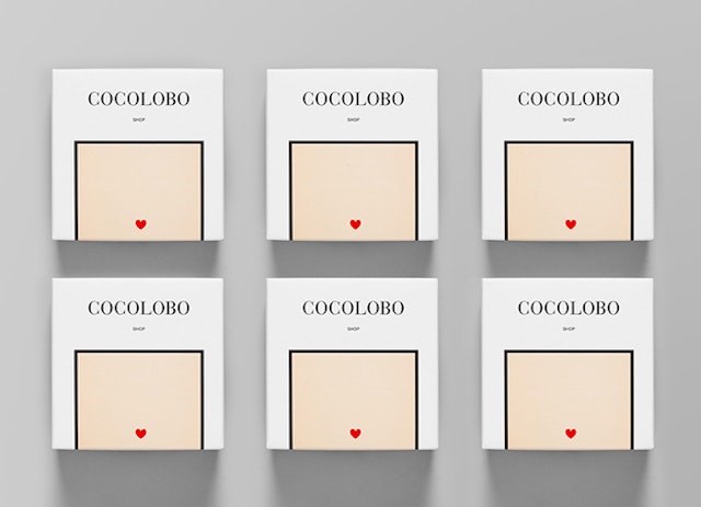
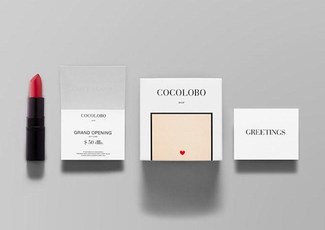
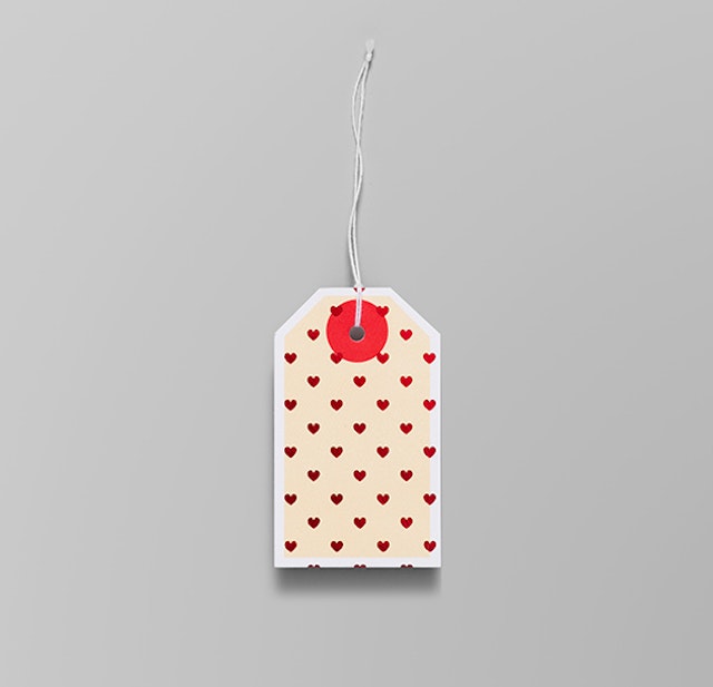
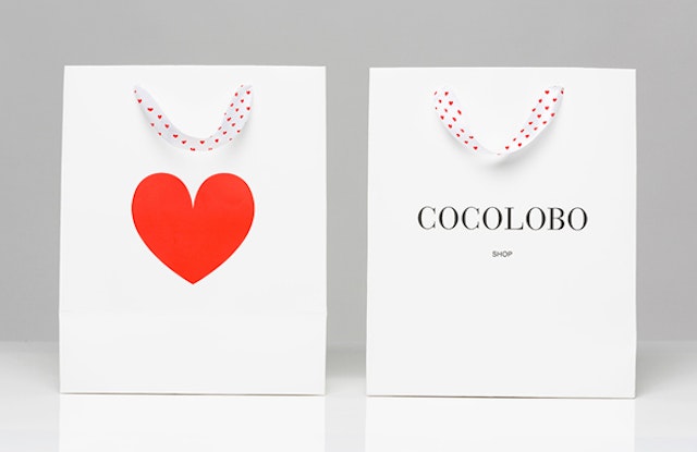
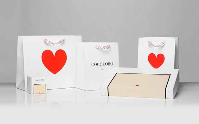
Anagrama - Cocolobo brand identity
Brand: CocoloboAgency: Anagrama, Monterrey, Mexico Agency website: http://www.anagrama.comCreative Director: Sebastian PadillaArt Director: Mike HerreraPhotographer: Caroga PhotographerPublished: May 2013Short rationale (optional): Cocolobo is a high-end shopping boutique that caters exclusively to strong women with a confident and in vogue fashion sense. For the naming, we played with the shop's main patrons' characteristic duality, in a catchy and fun play with words: "Coco" (coconut in Spanish) and "lobo" (Spanish for wolf). The Cocolobo woman is not only feminine and sweet, but also independent, aggressive, sensuous and daring. The color palette also invests in this polarity, with black and white portraying the elegant, sober aspect of the brand and the red representing all that is feminine and chic.The layout is modern and simple while the typographic palette emits exclusivity, rounding up the brand as one with dignity and class. In direct and striking contrast stands the heart icon and pattern, rendering a luscious playfulness and channeling the brand to the world of lipstick loaded kisses and little red dresses.
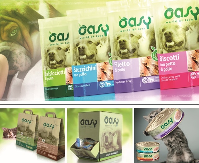
Break: Oasy Wonderfood brand identity, strategy and packaging
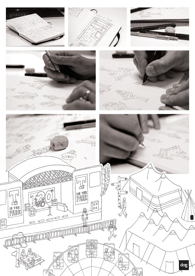
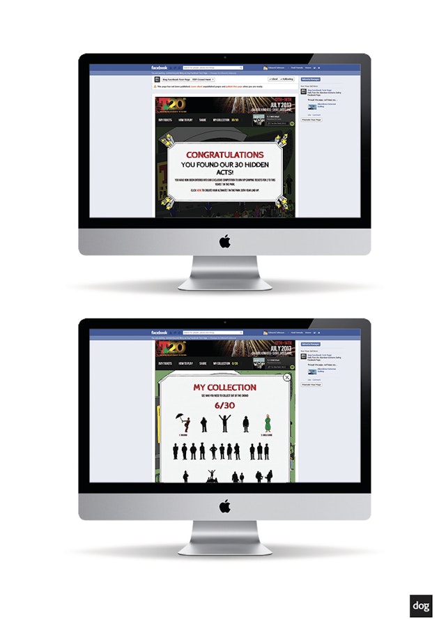
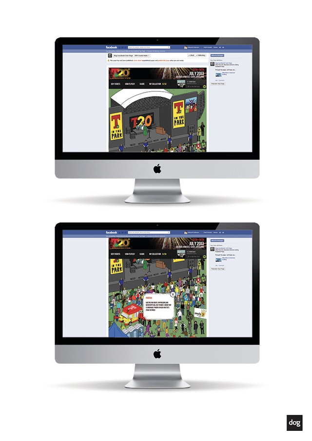
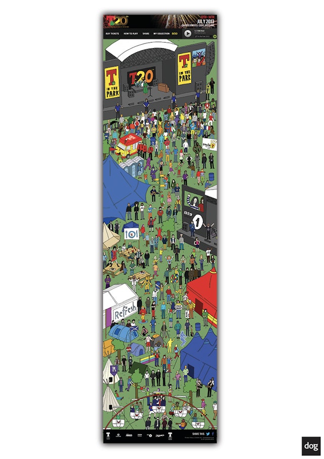
Brand: T in the ParkTitle(s): The T in the Park CrowdHuntAgency: Dog Digital, Glasgow, Singapore, London Agency website: http://www.dogdigital.com Creative Director: Alex WilsonArt Director: Emily Gauder Copywriter and Head of Marketing: Stephanie LindsayIllustrator: Rob Johnson Additional credits: Account Director: Kevin Clay Poole-McCloskeyDevelopers: Robert Lawson & Andrew MarquisJunior Designer: Justin Logue Published: June 2013Short rationale (optional): In the final weeks before the festival, T in the Park organisers were keen to release digital offerings that would increase exposure and engagement with the T in the Park brand. ‘The T in the Park Crowdhunt’, an interactive animated app, presents fans with a detailed animation depicting the Festival stages and campsite including a full T in the Park crowd. 30 acts from the 2013 line up are hidden amongst the crowd and fans are challenged to find all 30 artists, after which they will be entered into a competition draw to win a pair of VIP camping tickets.
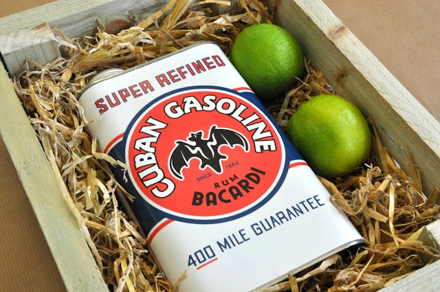
Path: Bacardi Cuban Gasoline - a blue sky concept for Bacardi
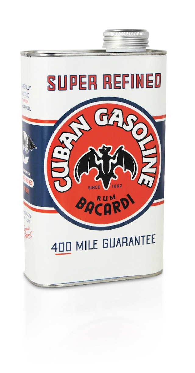
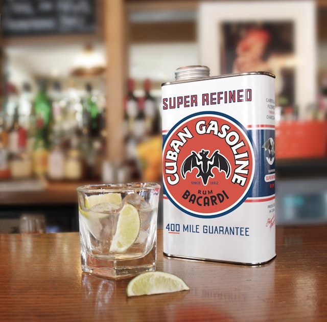
Brand: BacardiTitle(s): Cuban Gasoline, a blue sky concept for BacardiHeadline and copy text (in English): "During the prohibition of the 1920’s, Americans still looking for a good time were flocking to the island of Cuba. The speakeasies from Miami to Chicago were soon clamouring for that unique taste of Cuba: Bacardi rum.Throughout this period, oil cans were often used to disguise and transport illegal liquor across the States, and so various spirits, smuggled into the country, were served in underground bars all over America from cans and tins of many shapes and sizes. The speakeasy slang for Bacardi soon became Cuban Gasoline - a drink that ignites parties and fuels good times."Agency: Path, London, UKAgency website: http://www.path-designs.comCreative Team: Tim Bousefield / Chris Forecast / Ben Sillence / Mario Herran / Susan ShelleyPublished: April, 2013Short rationale (optional): Cuban Gasoline is a ‘blue-sky’ concept produced by our design team at Path, and is inspired by the trends for unconventional packaging and the increase in men looking for unique drinking experiences.Bacardi is a brand and product no longer seen as a particularly masculine proposition – over the decades it has become synonymous with feminine cocktails and mixes. The Unisex Economy has upended gender conventions in alcohol, and so we sought to harness the growing demand among men for more masculine cocktails by developing a unique proposition - Cuban Gasoline. It is historical fact that during the prohibition of the 1920's, oil cans and tins were often used to smuggle liquor across the states.This gave us the inspiration to create a truly remarkable and unique structural format that not only has a clear stand-out presence on shelf, but also embodies the spirit and history of the prohibition.A key part of our strategy was to empower the consumer with a sense of knowledge, telling a story that would be retold in bars among friends and creating a real point of difference. The unique and unconventional structure and branding differentiates the proposition in the market, while still embodying the spirit and ethos of the Bacardi brand.The use of bold typography and a limited colour palette was inspired by the branding of 1920’s American oil-cans – helping add authenticity and belief to the proposition, as well as creating a style that is uniquely different from many of the market competitors.
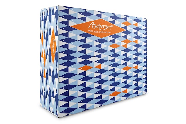
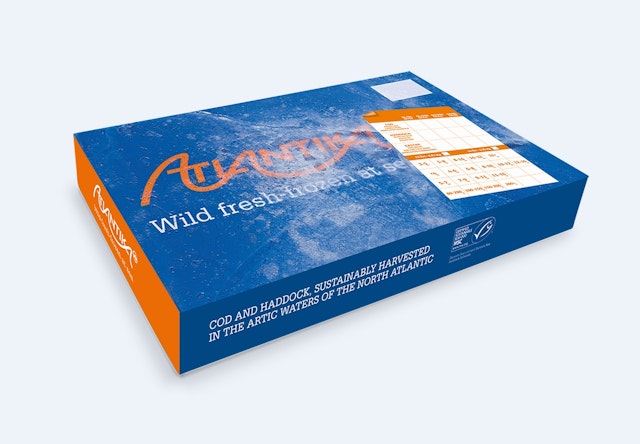
Carter Wong: Ocean Trawlers industrial packaging
Brand: Ocean TrawlersTitle(s): Industrial packaging for frozen-at-sea Cod and HaddockAgency: Carter Wong design, London, EnglandAgency website: http://www.carterwongdesign.comCreative Director: Phil CarterArt Director: Phil CarterCopywriter: Phil CarterDesigner: Phil Carter and Martyn GarrodPublished: May 2013Short rationale (optional): Being aware that most manufacturers use plain white boxes for their packaging, which creates a sea of white in cold-store warehouses, we took the opportunity to create something very graphically distinctive. By doing so we achieved maximum brand stand out of our outer packs and high visibility for the fork lift truck drivers. For the inner packs the most important message was to show that the contents were frozen-at-sea, unique to this company. By literally freezing the box in ice and photographing it we achieved this illusion.
18 Feet & Rising: Kopparberg 'Forest Happenings' TV advert
Brand: KopparbergAgency: 18 Feet & Rising, London, UKAgency website: http://www.18feet.co.uk Creative Director: Stephen de WolfAdditional credits: Creatives: Alex Delaney & Behrad TaherparvarAgency Producers: Julia Methold & Ali JoyceStrategic Business Lead: Rob WardAccount Director: Adrienne LittleProduction Company: 15 BadgersDirector: Lars TovikProducer: Toby CourlanderEditor: Christian Lyndon @ Absolute PostPost Production: Phil Oldham & Zee @ Absolute PostDOP: Dan BrookesSound: Aaron Reynolds @WavePublished: June 2013
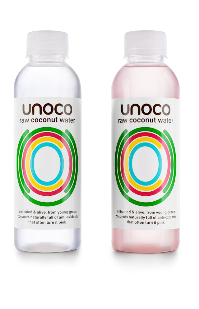
Pearlfisher: Unoco packaging
Brand: Unoco Headline and copy text (in English): Creation of the first truly raw coconut water brand – UnocoAgency: Pearlfisher, London, UKAgency website: http://www.pearlfisher.comCreative Director: Sarah Cattle, Creative Director, PearlfisherArt Director: Dan Gladden, Design Director, PearlfisherCopywriter: Sylvie Saunders, Head of Words, PearlfisherAdditional credits: Sophie Maliphant, Designer, Pearlfisher; Georgia Levison, Senior Strategist, PearlfisherPublished: June 2013
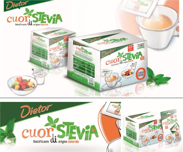
Break: Cuor Di Stevia Leaf brand identity and packaging design
Brand: Cuor Di Stevia LeafAgency: Break, Milan, ItalyAgency website: http://www.break.itCreative Director: Simona BaldoPublished: March 2013
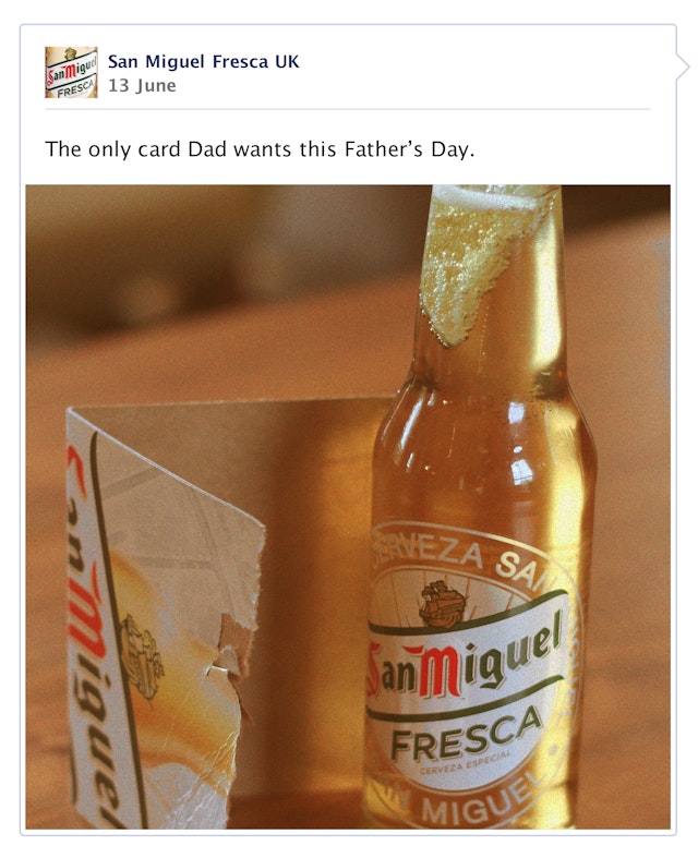
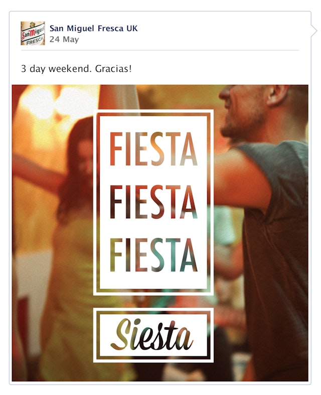
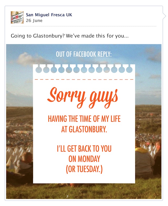
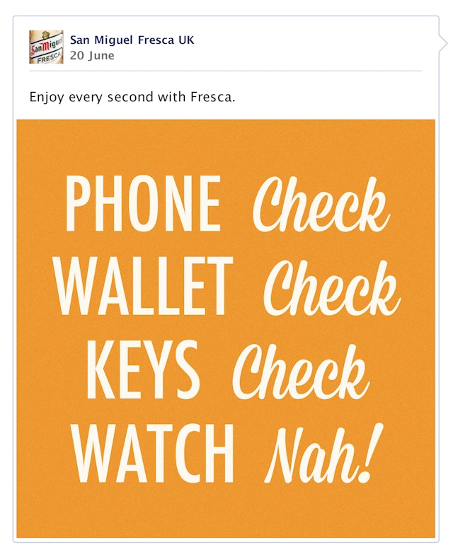
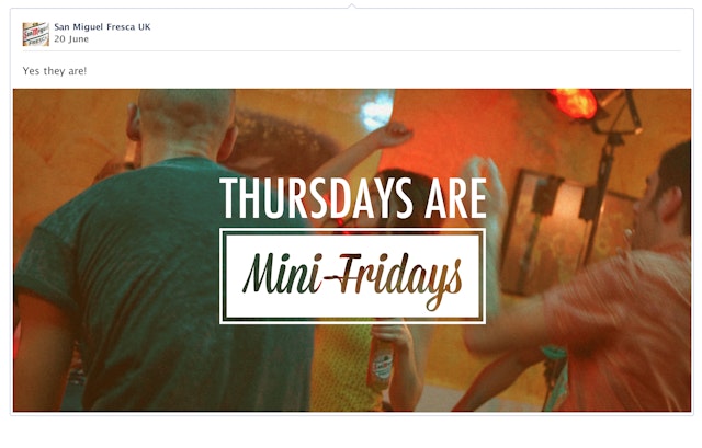
LBi: Brand: San Miguel Fresca (Carlsberg UK) Hola Vida social media campaign
Brand: San Miguel Fresca (Carlsberg UK)Title(s): Hola Vida social media campaignHeadline and copy text (in English): Hola Vida. Minutes don’t matter when you live every second. Grab a Fresca.Agency: LBi, London, UKAgency website: http://www.lbi.com Creative Director: Abi EllisArt Director: Iain Phillips Copywriter: Victoria TrowAdditional credits: Designer: Paul Price Snr Community Manager : Aisling ThorntonSenior Account Manager: Nicky Wright Published: Month, Year May 2013 onwardsShort rationale (optional): San Miguel Fresca is a brand new beer to the UK market, so our challenge was to help establish a purpose and positioning for this new brand. A purpose so powerful that it will steal a disproportionate share of cultural relevance for the 18-25 year old target audience, encouraging them to trial San Miguel Fresca in the upbeat moments that they share with their friends. With a new TVC as our reference point, we created a point of view for the brand which celebrates taking a positive, refreshing view on the everyday. We used this to create easily shareable content which will drive awareness of the product and ultimately encourage people to seek out a Fresca.
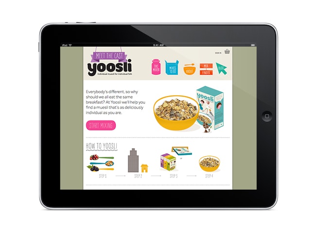
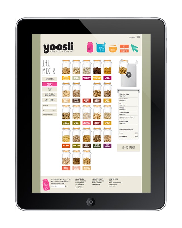
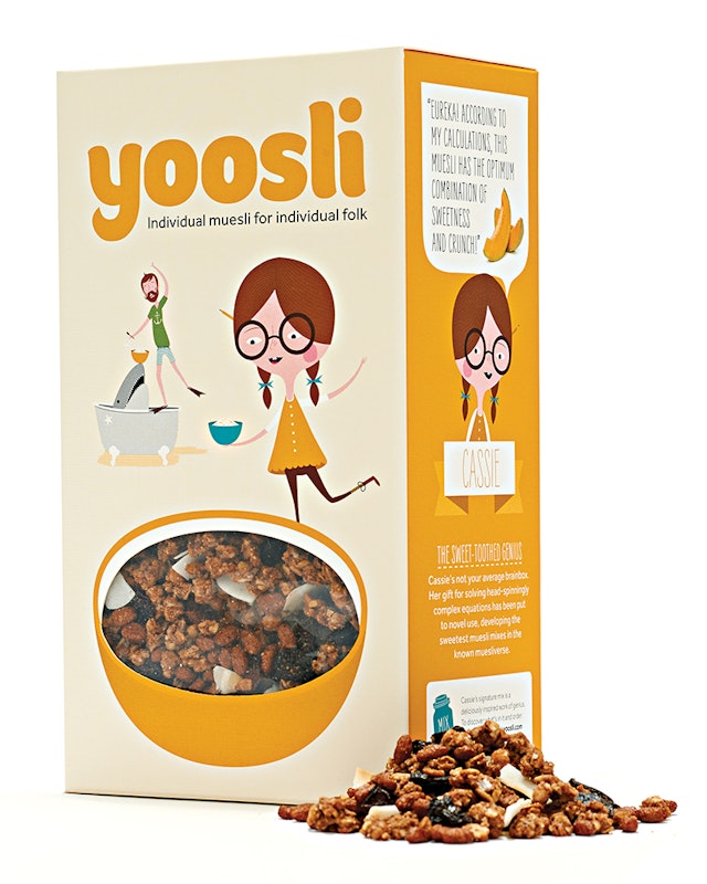
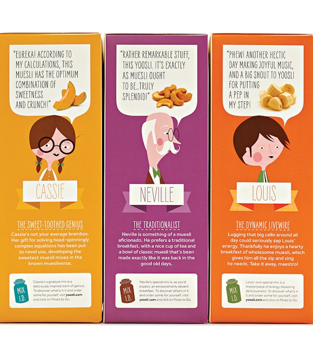
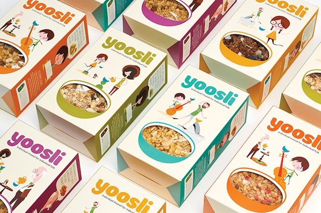
Together Design: Yoosli brand identity, e-commerce website and packaging
Brand: YoosliTitle(s): Brand identity, e-commerce website and packagingAgency: Together Design, London, UKAgency website: http://www.togetherdesign.co.ukCreative Director: Katja ThielenBrand Planner: Emily PennyCreative Lead: Bryony AkehurstDesigner: Pete BlakeCopywriter: Maf BishopIllustrator: Andrew BanneckerAnimators: Young StudioUX and development: Future BuildingPublished: June 2013Short rationale: Entrepreneur Markus Niemeier wanted to create a new way for people to buy muesli. Yoosli.com enables customers to choose exactly what’s in their muesli from over 65 cereals, nuts, seeds and fruits, and have it delivered in slim-line packs. The central concept for the design is personalisation, with emphasis on it being a joyful and creative mixing experience. We created the strapline ‘Individual muesli for individual folk’ and devised a cast of eccentric characters – Louis, Cassie, Flora, Neville and Bob – each of whom represents a different personality and muesli flavour. The project included the naming, brand identity, copy-writing, packaging, e-commerce site and an animated movie.
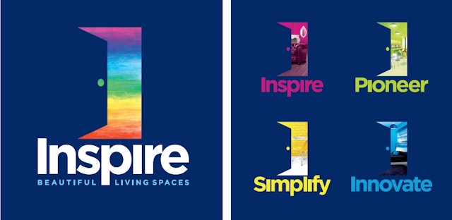
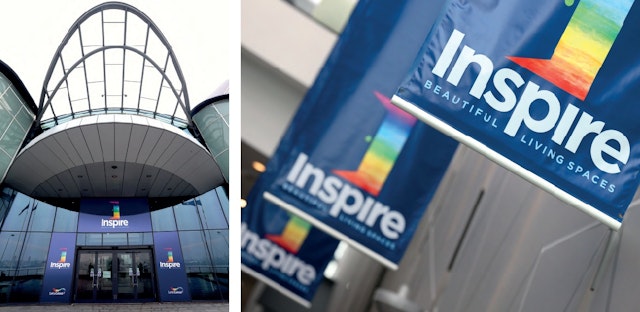
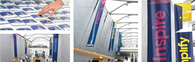
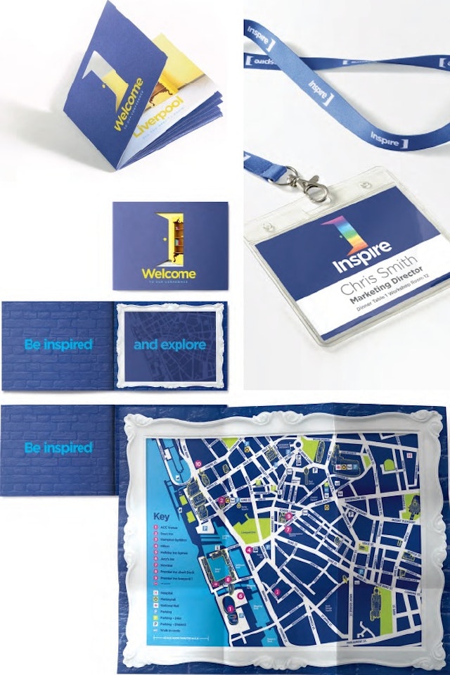
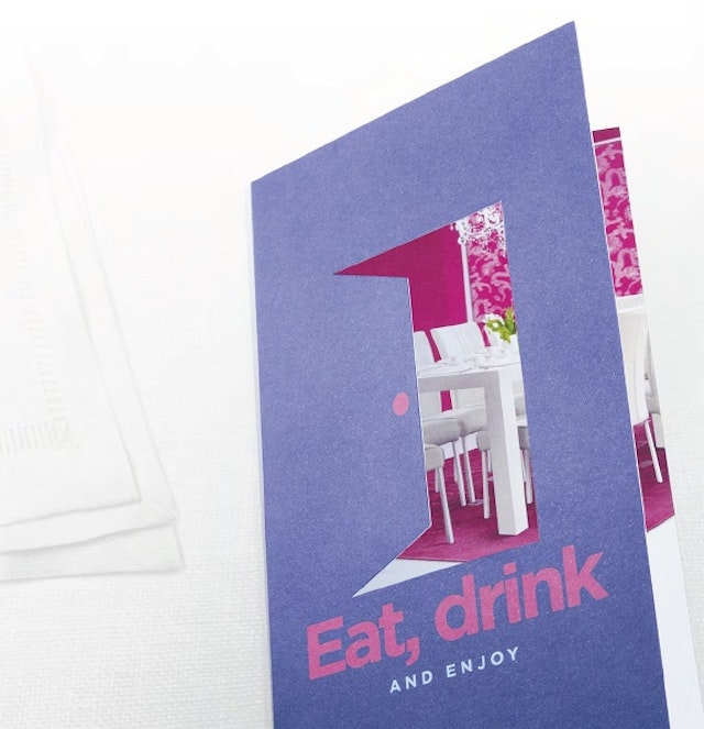
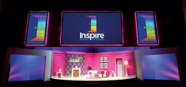
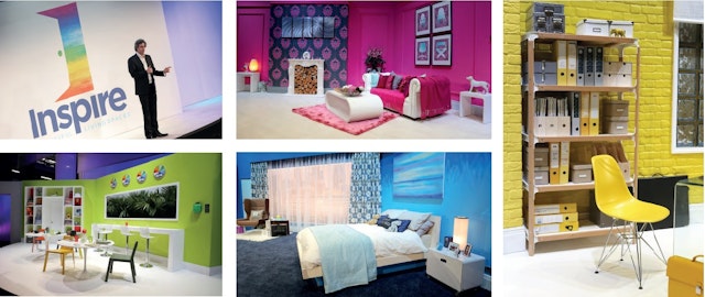
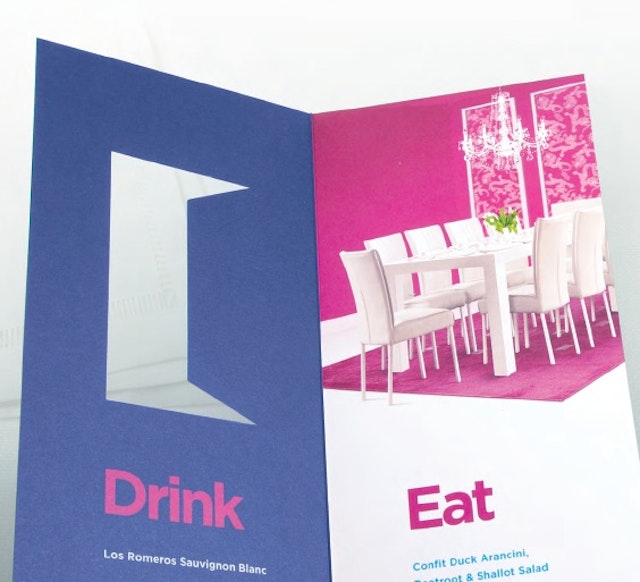
Springetts: Akzo Nobel - Inspire Company Conference 2013 branding and identity
Brand: Akzo NobelTitle(s): Inspire Company Conference 2013 branding & IdentityAgency: Springetts, London, UKAgency website: http://www.springetts.co.ukCreative Director: Moyra CaseyArt Director: Christopher McDonaldIllustrator: Peter O’Connor, Stuart WitterAdditional credits: Stage designs created by Four impactPublished: March 2013
Break: Saila Real Fresh brand identity, packaging and retail design
Brand: Saila Real FreshAgency: Break, Milan, ItalyAgency website: http://www.break.itCreative Director: Luca CerriPhotographer: AplombPublished: December 2012
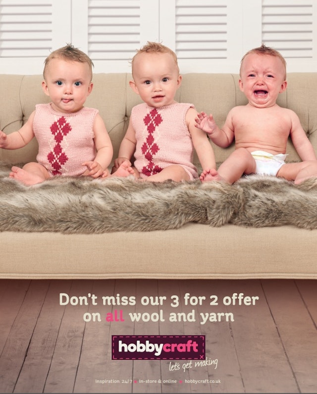
krow Communications: Hobbycraft press ad
Brand: HobbycraftTitle(s): Hobbycraft – let’s get makingHeadline and copy text: Don’t miss our 3 for 2 offer on all wool and yarnAgency: krow, LondonAgency website: http://www.krowcommunications.comCreative Director: krowArt Director: krowCopywriter: krowPhotographer: Tony BriggsPublished: July 2013
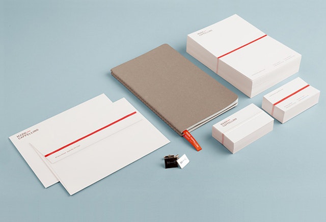
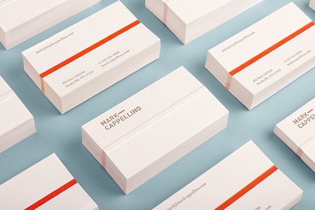
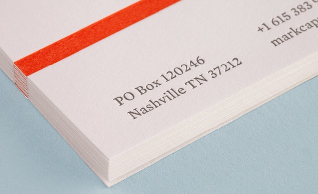
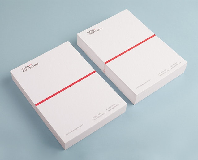
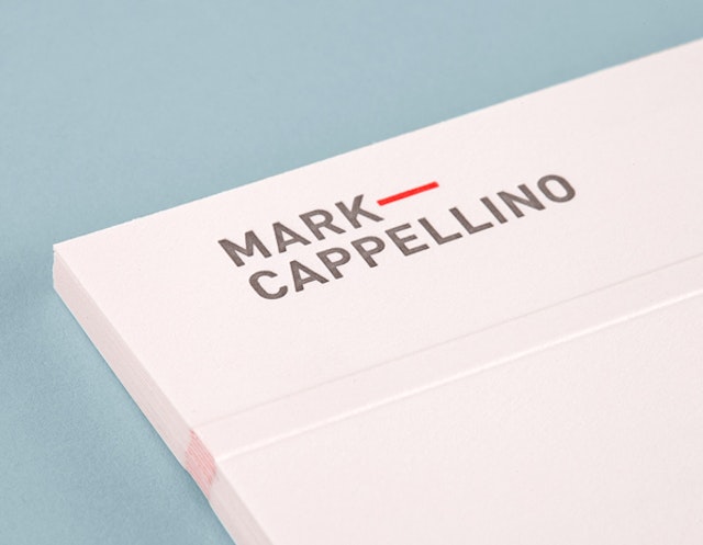
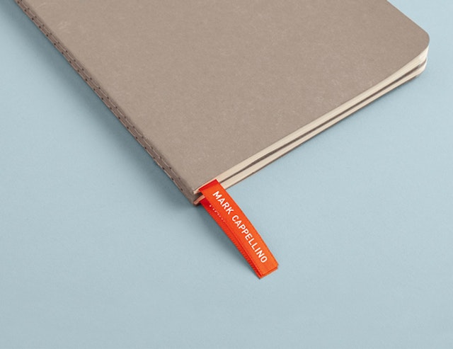
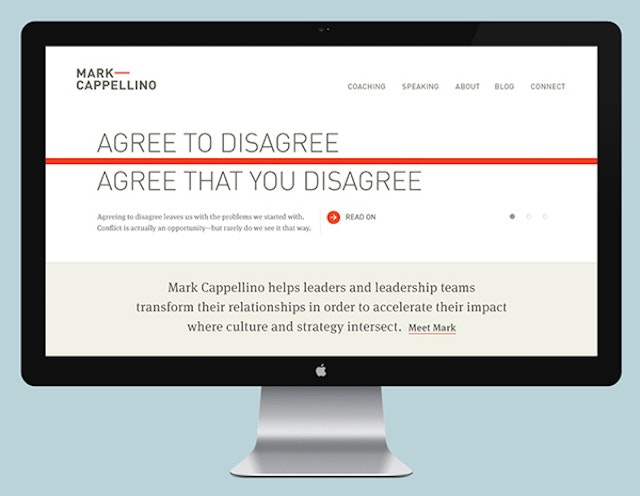
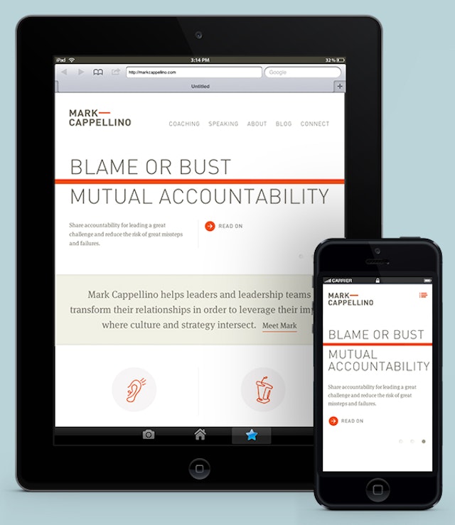
Perky Bros.: Mark Cappellino brand identity
Brand: Mark CappellinoAgency: Perky Bros, Nashville, TNAgency website: http://perkybros.comCreative Director: Jefferson Perky Art Director: Jefferson PerkyPhotographer: Robby KleinPublished: June 2013Short rationale (optional): Mark Cappellino is a leadership consultant. Mark travels worldwide helping individuals and teams better communicate through stronger relationships. We created his identity based on the behavioral beliefs that shape his practice. Mark’s logo plays on the typographic device called the em dash, meaning an interruption of thought. The em dash comes to life as a red thread which according to Chinese legend connects all of us—tangling, stretching, but never breaking.
AMV BBDO: TOTAL Greek Yoghurt TV ad
Brand: Total Greek Yoghurt Agency: AMV BBDO, London, UK Agency website: http://www.amvbbdo.com Art Director: Ian Gabaldoni Copywriter: Richard Baynham Additional credits: TV Producer: Ally MeeMedia Agency: Total MediaMedia Planner: Andy TravisProduction Company: HLADirector: Simon RatiganProduction Co. Producer: Tim DaukesDOP: Karl OscarssonProduction Designer: Marco PuigLocal Production Facility: Maria Kopanou at Green DriveEditing: Bruce Townsend assisted by Ed Enayat at The QuarryPost-Production Company: The Mill (Grading by Seamus O’Kane) and AMV Digi-Lab (Tony Aldridge and Andrew Maddison)Audio Post-production: Will Cohen at AMV Audio Suite Music: Aphrodite Composer: Oli Julian Production Co/Publisher: SoundtreeArranger: Soundtree MusicPublished: June 2013
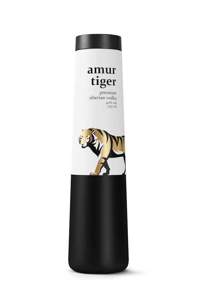
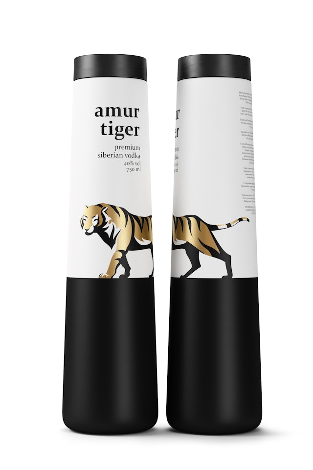
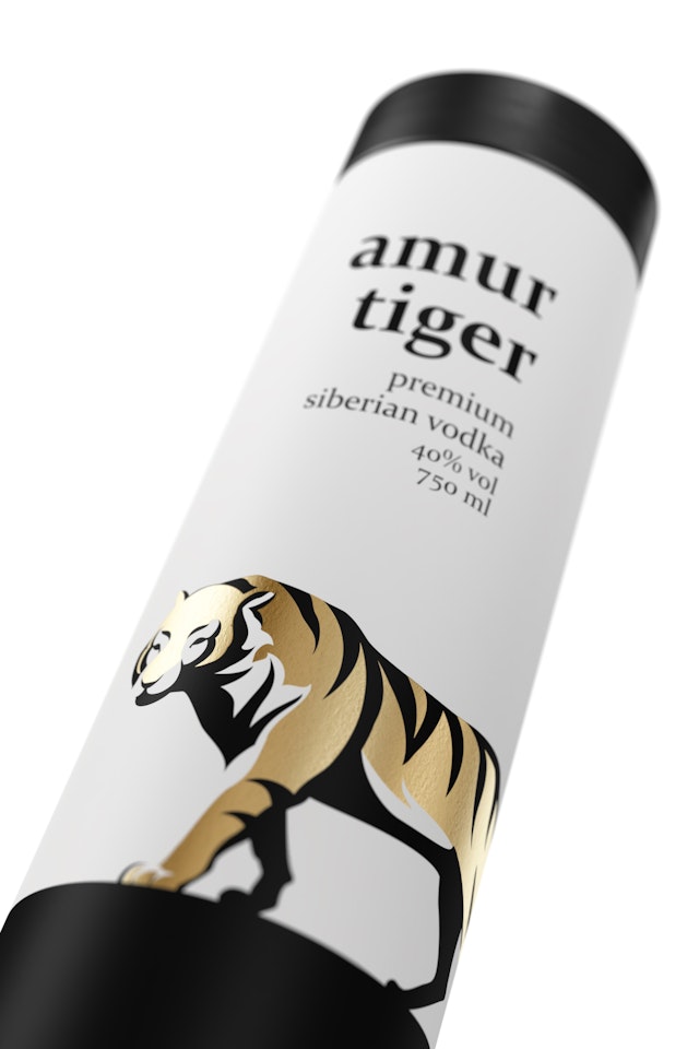
GJ PACKAGING: Amur Tiger Vodka packaging
Brand: Amur Tiger VodkaAgency: GJ PACKAGING, Lisbon, PortugalAgency website: www.gj-packaging.comCreative Director: Guilherme JardimIllustrator: Fábio VieiraAdditional Credits: Pedro Andre and Vladimir PospelovPublished work: May 2013
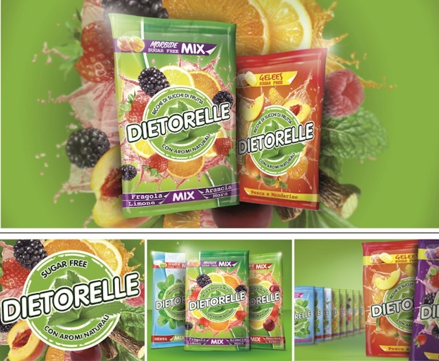
Break: Dietorelle Leaf brand identity, retail and packaging design
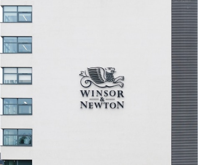
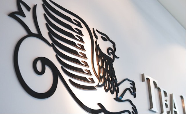
Pearlfisher: Winsor & Newton global brand identity
Brand: Winsor & NewtonHeadline and copy text (in English): A new global brand identity for Winsor & NewtonAgency: Pearlfisher, London, UKAgency website: http://www.pearlfisher.comCreative Director: Sarah Cattle, Creative Director, PearlfisherArt Director: Karen Welman, Founding Partner & Chief Creative Officer, PearlfisherAdditional credits: Darren Foley, Managing Director, Pearlfisher; Rory Fegan, Senior Strategist, PearlfisherPublished: May 2013
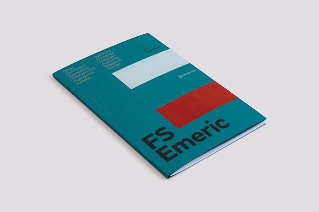
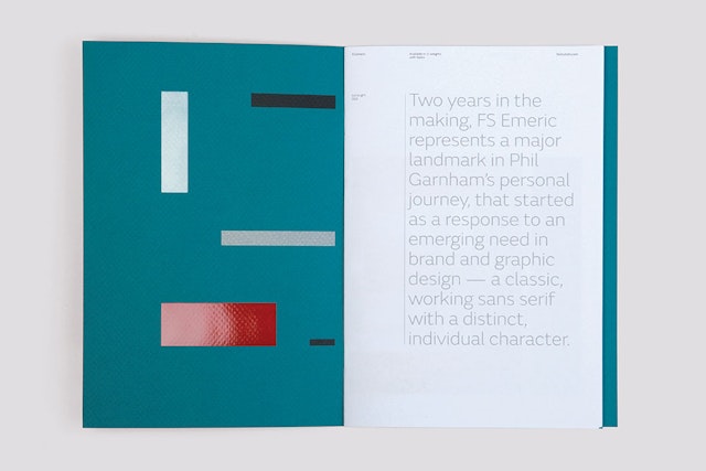
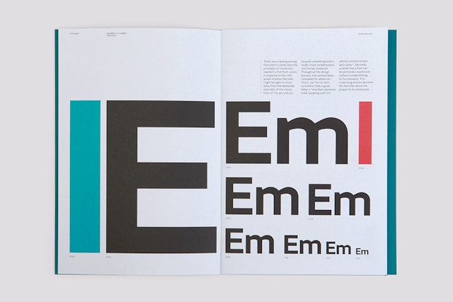
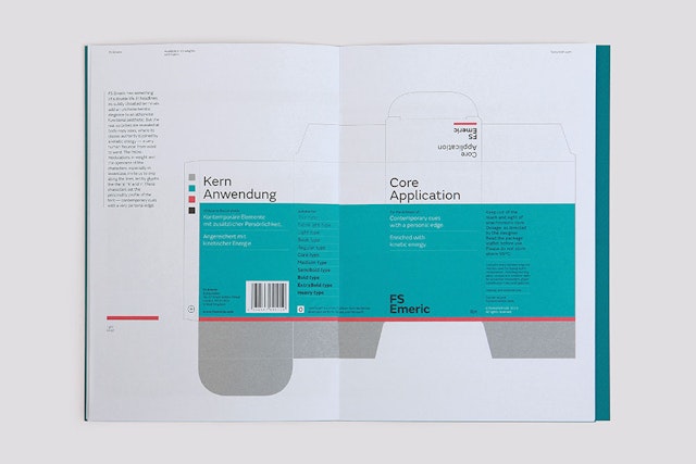
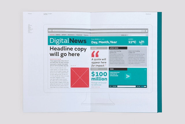
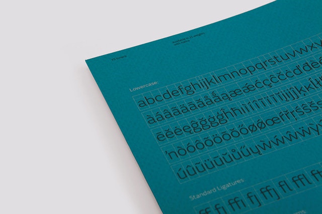
Believe In: Fontsmith - FS Emeric type specimen booklet
Brand: Fontsmith Title(s): FS Emeric type specimen bookletAgency: Believe In, Devon, UKAgency website: http://www.believein.co.uk Creative Director: Blair ThomsonCopywriter: Ian ThompsonAdditional credits: Typeface ‘FS Emeric’ designed by: Phil GarnhamBooklet Printed by: Identity PrintPaper Supplied by: GF Smith Published: April 2013Short rationale (optional): The type of specimen booklet FS Emeric is Fontsmith’s most ambitious to date, and follows the enormous success of their 2011 promotional campaign, ’10 Years in Type’. The booklet tells the story of FS Emeric via the language of brands – incorporating design for print, product, digital and architectural environments. A range of hypothetical applications are used to demonstrate FS Emeric’s versatility, with the intention of inspiring both designers and clients of its potential. Elements of the typeface are used throughout the booklet to add illustrative elements, graphic details and define the visual language of the piece. By using a typographic approach founded on the same moderinst principles of the typeface, the booklet evokes a timeless sense that connects the past, present and future. The design is kept intentionally pure, focussing on the personality and strengths of FS Emeric and allowing designers to visualise how it may exisit through their own work.
krow Communications: DFS TV ad
Brand: DFSTitle(s): Beach hutsHeadline and copy text (in English): The Sale of the SummerAgency: krow, LondonAgency website: http://www.krowcommunications.comCreative Director: krowArt Director: krowCopywriter: krowDirector: Pedro RomhanyiProduction Co: OutsiderMusic: “Here Comes the Summer” by The UndertonesPublished: July 2013
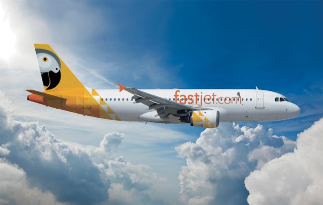
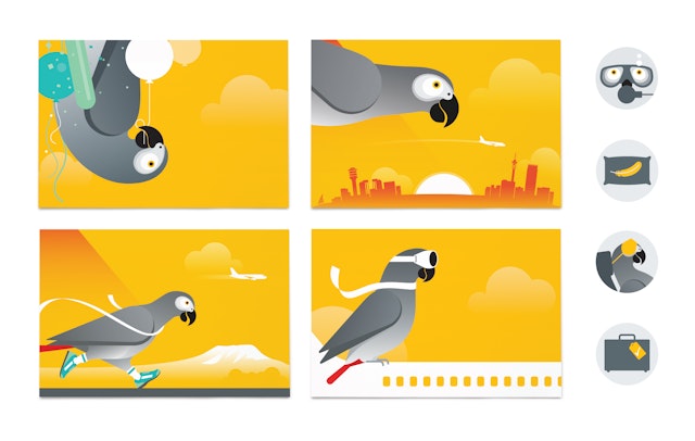
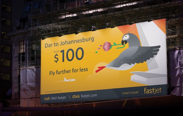
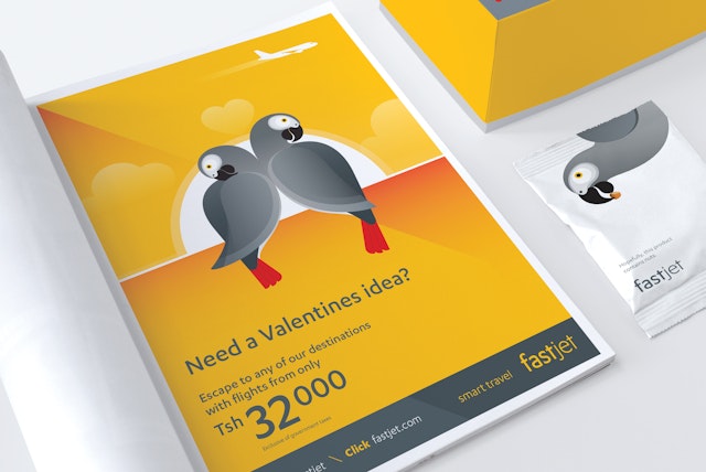
SomeOne: fastjet brand launch
Brand: fastjetTitle: fastjet brand launchAgency: SomeOneAgency website: someoneinlondon.comCreative Director: Simon ManchippArt Director: Mark SmithCopywriter: Simon ManchippIllustrator: Mark SmithPublished: November 2012
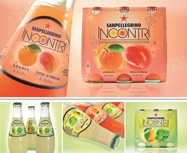
Break: Sanpellegrino brand identity, packaging and retail design
Brand: SanpellegrinoAgency: Break, Milan, ItalyAgency website: http://www.break.itCreative Director: Alessandro Di BelloPhotographer: XL, Luca ColomboPublished: April 2013
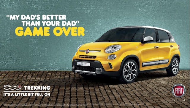
krow Communications: Fiat 500L Trekking press ad
Brand: FiatTitle(s): 500L TrekkingHeadline and copy text (in English): “MY DAD’S BETTER THAN YOUR DAD” GAME OVER500L Trekking – It’s a little bit full onAgency: krow, LondonAgency website: http://krowcommunications.comCreative Director: krowArt Director: krowCopywriter: krowPublished: July 2013
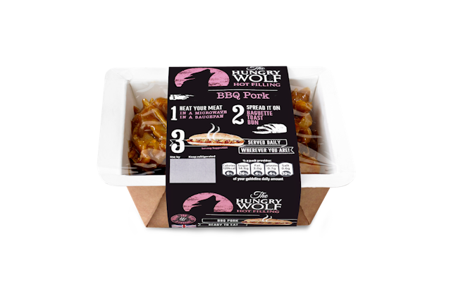
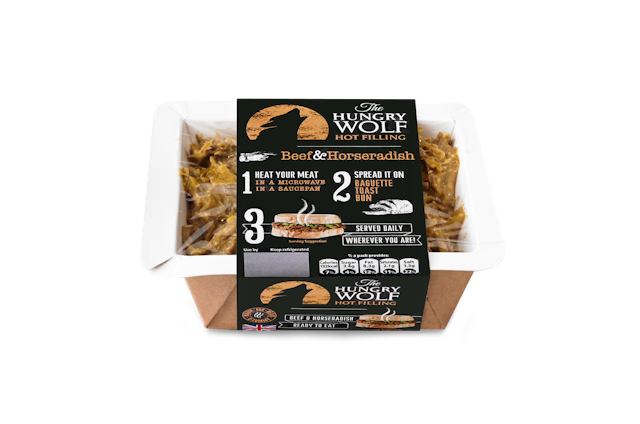
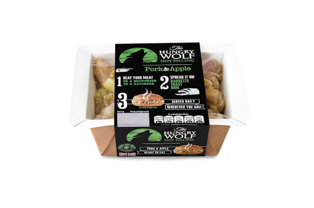
Coley Porter Bell: Hungry Wolf packaging and branding
Brand: The Hungry WolfAgency: Coley Porter Bell, London, UKAgency website: http://www.cpb.co.ukCreative Director: Stephen BellDesigners: Jennie Plant and Valeria MurabitoAdditional credits: Senior Account Director: Maree McNicholPublished: May 2013Short rationale (optional): Coley Porter Bell has created the name, branding and packaging for The Hungry Wolf, the first branded product from Fresh Pak Chilled Foods, the UK’s largest dedicated manufacturer of sandwich fillings. The Hungry Wolf is the first deli-filler designed to be served hot with bread. The brand aims to open up a new segment in the £12m deli filler market using the language and cues of gourmet street and festival food. It is positioned as ‘gourmet street tucker you can enjoy at home’.
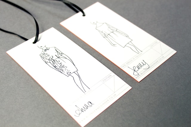
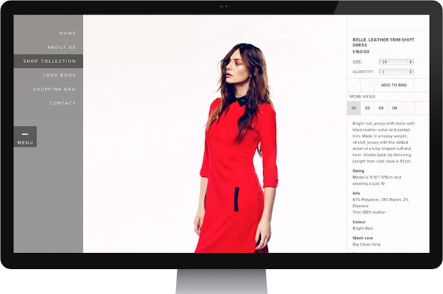
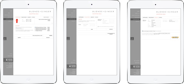
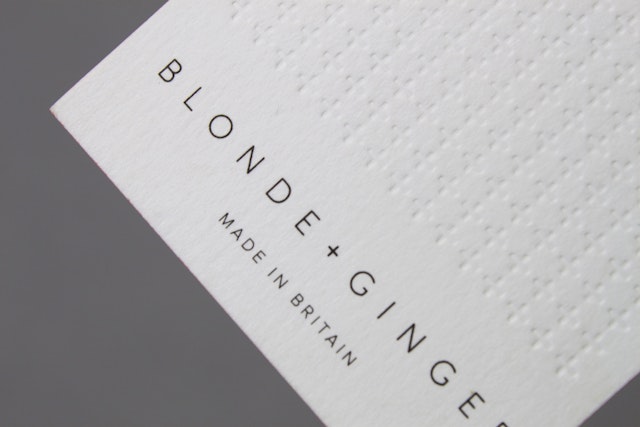
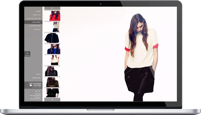
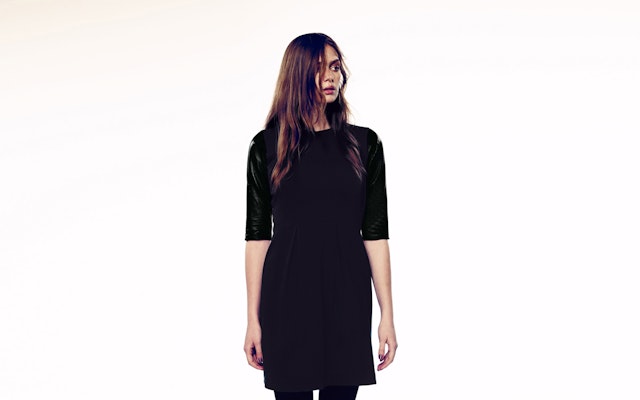
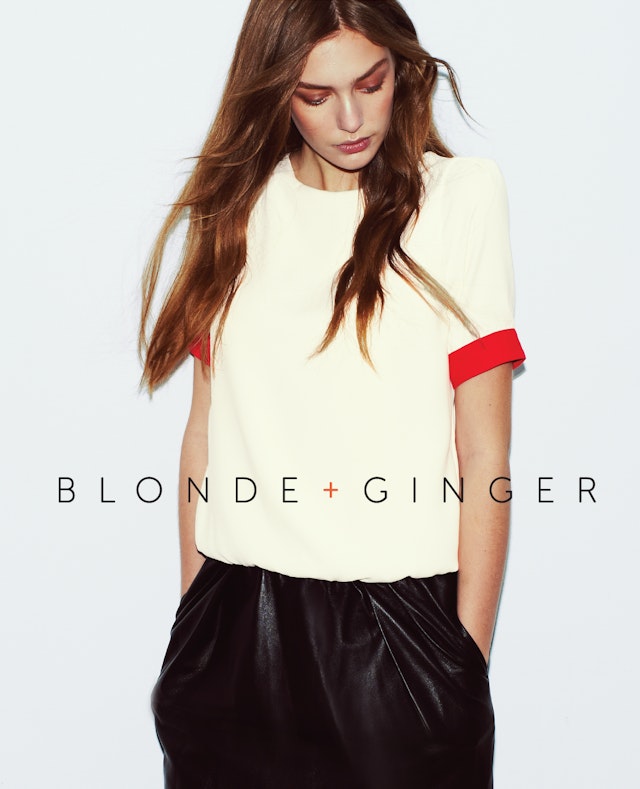
Ahoy: Blonde + Ginger brand identity and collateral
Brand: Blonde + Ginger Agency: Ahoy, Manchester, UKAgency website: www.ahoy.co.ukArt Director: Matthew Hill Photographer: Jon GorriganBrand Strategist: Antonio Giansante Published: April 2013 Short Rationale: Independent fashion retailer Blonde + Ginger approached Ahoy at the concept stage of building its identity. Keen to stand out in a competitive environment, Blonde + Ginger needed to develop an engaging look and feel that would enable it to sit alongside similar high-end clothing labels. Ahoy was tasked with developing the company’s identity, managing printed materials and website development as well as overall branding including logo, typography and tone of voice. A large element of the project involved creating a brand that could be used across a number of different touchpoints including swing tickets, clothing labels, business cards and the website. It was important that the brand conveyed a distinct personality and style in order to stand out from other fashion lines, while simultaneously cultivating an identity that would enable the brand to successfully compete in its category.Swing tickets and business cards were produced to accompany all clothing orders and were designed to a high-spec finish with particular consideration given to touch and feel. Printed on 540gsm Colorplan, with a de bossed brand pattern, each card includes a space on the reverse that allows Blonde and Ginger to include hand-drawn sketched images to accompany each limited edition dress. Both the swing tickets and business cards included painted edges using a Pantone colour new to 2013 for the card’s edging, Tangerine Tango 8625U. The contrast of shock-colour edging against the organic face of the card emphasised the personality behind the brand, as well as providing a talking point upon exchange of the card itself. Ahoy designed and built the Blonde and Ginger website using its own content management system (CMS). The main aim was to let the photography do the talking. Full screen responsive imagery was used, which allows the images to alter the overall look of the site to coincide with a particular season. Image transitions and the animation used for showing and hiding the navigation gives the site a distinct interactive quality. Ahoy and Blonde + Ginger have built a strong, quality brand identity to successfully introduce Blonde + Ginger as a key player in the high-end fashion sector. Ahoy understood the importance of a coherent brand message on all levels and have worked with Blonde + Ginger to build a strong, quality brand identity. Ahoy has created a smooth experience for the Blonde + Ginger customer from start to finish, from online browsing and making a purchase to clothing labels and swing tickets, all complementing the quality of the core product.
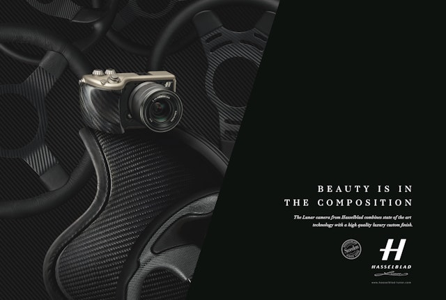
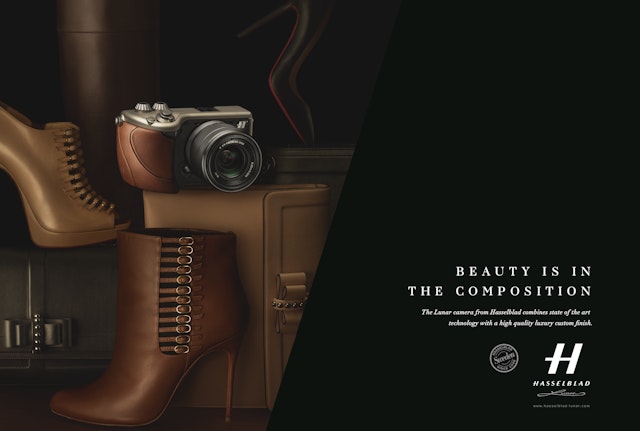
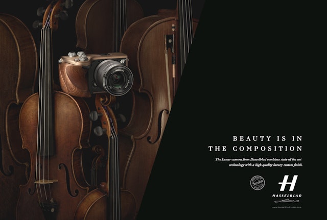
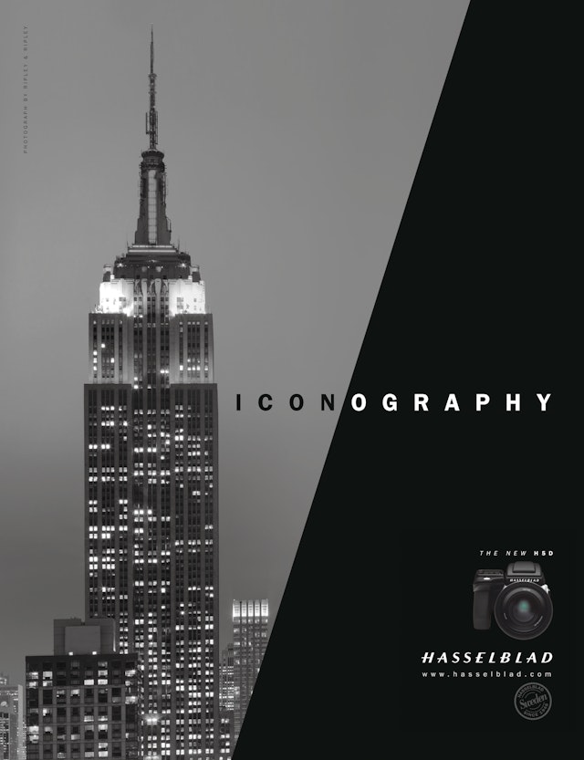
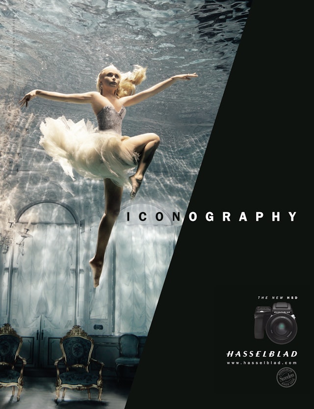
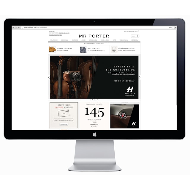
Springetts: Hasselblad H5D global advertising campaign
Brand: Hasselblad Title(s): Hasselblad H5D global advertising campaign Headline and copy text (in English): Global creative strategy and advertising campaign for Hasselblad professional andluxury divisions. Agency: Springetts, London, UK Agency website: http://www.springetts.co.uk Creative Director: Moyra Casey Design & Art Direction: on Vallance & Christopher McDonald Photographer: NASA/Hasselblad, Henrik Sørensen, Ripley & Ripley and Peter Lipman Additional credits: Media Planning by Mindshare - Digital adsdeveloped by GrandadPublished: June 2013 Short rationale (optional): Our task: to develop a new creative strategy and global advertising campaign that reinforced the photographic credentials of Hasselblad amongst professional photographers and created awareness and desire for their new Lunar luxury camera range. The ‘professional’ campaign was based on the theme of ‘iconography’ using images of the moon landings to the Empire State Building. It brings this idea to life through paralleling Hasselblad as the icon in photography with iconic images shot with a Hasselblad. The consumer campaign launched the new Lunar camera, featuring the headline ‘beauty is in the composition’ and photography by Peter Lipman. The Lunar cameras are customisable with various luxury materials. The campaign was optimised in both print and digital media with digital formats developed by Grandad.
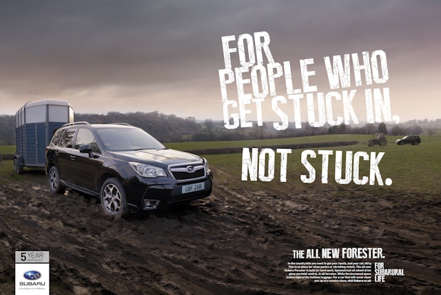
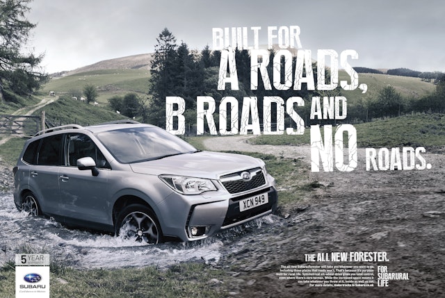
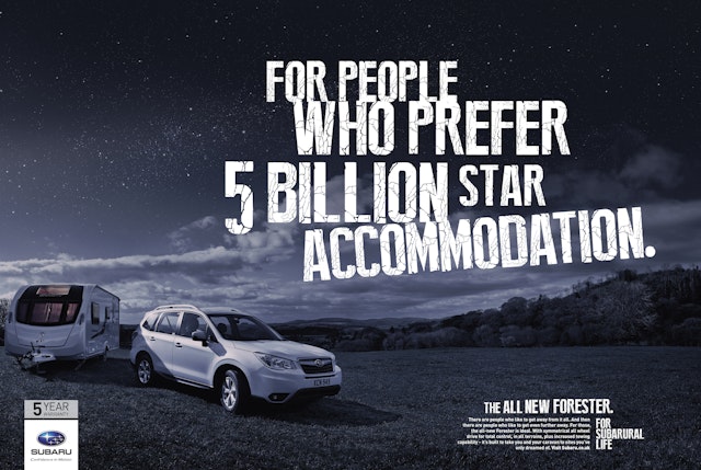
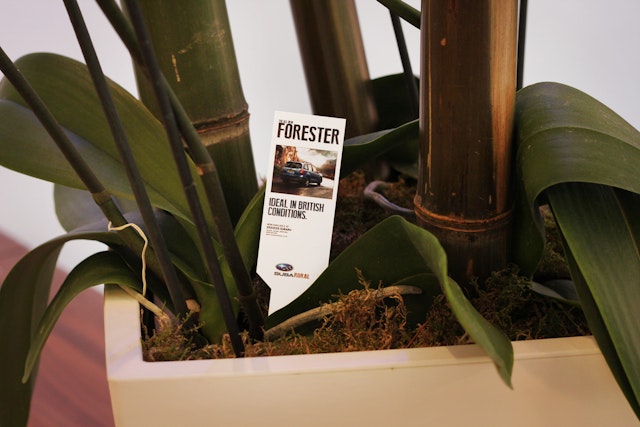
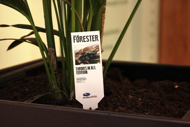
BJL: Subarual campaign
Brand: SubaruTitle(s): Subarural Agency: BJL, Manchester, UKAgency website: www.bjl.co.ukCreative Director: Tom Richards Published: May 2013